
How backgrounds transform fashion shoots for visual impact
TL;DR:
- Background choices in fashion shoots are deliberate decisions that influence mood, narrative, and brand message. Proper technical setup, including independent lighting and appropriate distances, ensures backgrounds enhance rather than distract from the subject. Elevating background planning to a creative priority can significantly improve image impact and client recognition.
The background in your fashion shoot is never just a surface. It’s a decision. Every shade, texture, and material you put behind your subject shapes what the viewer feels, what the brand communicates, and whether the image earns a second look. Yet backgrounds remain one of the most underplanned elements in fashion photography. This guide covers the artistic, technical, and practical dimensions of backgrounds so you can make intentional choices and build images with real narrative strength.
Table of Contents
- Why backgrounds matter: Beyond the basics
- Types of backgrounds and their uses in fashion shoots
- Technical essentials: Lighting, placement, and color harmony
- Edge cases and advanced techniques: Green screens, composites, and pitfalls
- A fresh perspective: Why most fashion shooters underestimate backgrounds
- Bring your vision to life with instant, professional backgrounds
- Frequently asked questions
Key Takeaways
| Point | Details |
|---|---|
| Backgrounds enhance storytelling | Choosing the right background brings out narrative and mood in fashion images. |
| Separation and lighting matter | Proper lighting and subject-background separation prevent distractions and make images pop. |
| Match color and context | Use color harmony and textures to support the subject and brand, not compete with them. |
| Versatile solutions boost workflow | Seamless rolls and cycloramas offer flexibility and consistency across shoots. |
Why backgrounds matter: Beyond the basics
Most photographers know lighting and posing inside out. But backgrounds? They often get chosen last, grabbed from whatever’s available in the studio. That’s a missed opportunity, and it shows in the final images.
Backgrounds in fashion shoots serve as integral storytelling elements, enhancing mood, context, and visual hierarchy rather than mere fillers. That’s a strong claim, but it holds up every time you compare two otherwise identical shots with different backgrounds. The subject doesn’t change. The clothing doesn’t change. But the story does.
“The background is not what your image is about. But it is why your image works.” — a principle every experienced fashion shooter eventually learns the hard way.
Think of visual hierarchy as a layered system. Your subject’s face sits at the top. The clothing carries the brand message. The background ties everything together by creating context. When the background conflicts with the clothing’s color story, or introduces visual noise at the wrong moment, the hierarchy collapses. The eye doesn’t know where to land.
Understanding the backdrop role in lifestyle shoots helps clarify why the same principles apply across fashion, commercial, and editorial work. The background is doing active work in every frame.
Here’s what a well-chosen background actually accomplishes in a fashion shoot:
- Context: Places the subject within a world, a season, a mood, or a brand universe
- Mood: Warm tones suggest energy and accessibility; cool, desaturated tones signal luxury or edge
- Story: Textured walls, architectural elements, and painted surfaces all imply a narrative before the viewer reads a caption
- Brand alignment: A minimalist concrete background reads very differently to a soft blush seamless paper, and your client’s audience knows the difference instinctively
Keeping an eye on fashion shoot backdrop trends helps you stay current and pitch creative ideas with confidence.
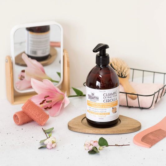
Types of backgrounds and their uses in fashion shoots
With the “why” established, the next question is practical. What are your actual options, and when does each one work best?
| Background type | Visual effect | Best for | Common pitfalls |
|---|---|---|---|
| Seamless paper | Clean, minimal, controlled | E-commerce, lookbooks | Tears easily, limited texture |
| Fabric/muslin | Soft folds, painterly feel | Editorial, portrait fashion | Wrinkles if unsteamed |
| Textured/printed vinyl | Rich detail, realistic surfaces | Fashion, product, lifestyle | Needs correct lighting angle |
| Hand-painted canvas | Organic, artistic, unique | High-end editorial | Inconsistent across panels |
| Cyclorama (cyc wall) | Seamless infinity curve | Full-body fashion, video | Requires space and maintenance |
| Green screen | Flexible, post-production | Composite and digital fashion | Color spill, setup demands |
Seamless paper rolls in 9 to 12 ft wide neutral colors (white, gray, black) are workhorses for product and e-commerce work. For premium fashion shoots that need texture and an infinity look, fabric and cycloramas pull ahead quickly.
When it comes to fashion versus product photography, the priorities shift noticeably. Fashion favors contextual, colored, and textured backgrounds for storytelling. Product work prioritizes clean white and neutral tones for detail isolation. Knowing which mode you’re in before the shoot saves you from compromising both goals on the same set.
Textured backgrounds, such as a weathered concrete print, brushed stone, or aged plaster surface, give your subject something to exist within. They create depth. A flat, clean background can make a subject look pasted into the frame if the lighting isn’t perfect. Texture forgives minor inconsistencies and adds dimension that reads beautifully even in cropped or Instagram-sized formats.
Colored backgrounds open up a whole conversation about palette. A dusty rose background shifts the entire temperature of a shoot. A deep forest green creates instant luxury associations. You’re not just picking a surface. You’re setting the emotional frequency of every image from that roll.
Pro Tip: Use a cyclorama for any shoot requiring full-body movement or continuous floor-to-wall coverage. The infinity curve eliminates the floor line and creates a seamless visual space that reads as professional and high-end without post-production cleanup.
Check out different backdrop materials guide options and browse example backdrop styles to match your shoot’s visual identity.
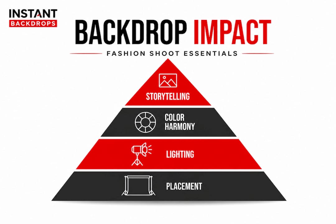
Technical essentials: Lighting, placement, and color harmony
Choosing the right background is only half the equation. How you light it and position your subject relative to it determines whether that choice pays off in camera.
The single most important technical rule: light your background separately from your subject. When one light source handles both, color contamination happens. A blue background throws cool light onto your model’s shoulders, shifting skin tones and creating unwanted color casts that take hours to correct in post.
Key mechanics include independent lighting of subject and background, with a minimum 3 to 8 feet of separation to prevent spill. Use grids, flags, or snoots to control where your background light falls and keep it off your subject entirely.
Here’s a straightforward technical setup sequence for fashion shoots:
- Position your model at least 5 feet from the background to start. Adjust based on focal length and room size.
- Set your background lights first. Determine the exposure you want for the background independent of your subject.
- Block any spill with flags or barn doors on your background lights so nothing wraps around to your subject.
- Meter your subject lighting separately and balance to your desired ratio.
- Check color casts using a gray card or color checker before committing to a full set.
- Shoot a test frame and zoom in on shadow areas on your subject’s clothing to catch any background color contamination early.
The table below gives you a practical reference for common background setups:
| Background color | Subject distance | Lighting ratio | Visual result |
|---|---|---|---|
| White | 5 to 8 ft | Background 2 stops above subject | Clean, bright editorial |
| Black | 3+ ft, no spill | Background no light | Deep void, dramatic |
| Mid-gray | 4 to 6 ft | Even or slight background lift | Neutral, versatile |
| Colored (saturated) | 6 to 8 ft | Background 1 stop below subject | Rich tone, controlled mood |
White backdrops require overexposure by 2 to 3 stops for a crisp editorial look. Black backgrounds need no spill light and at least 3 feet of model distance to achieve the void effect that reads as intentional rather than accidental.
Color harmony between clothing and background is where a lot of fashion shoots succeed or fail quietly. The principle is clear: clothing darker than skin, lighter than background, creates a natural visual hierarchy. Complementary colors (opposite on the color wheel) deliver contrast and energy. Analogous colors (neighbors on the wheel) create cohesion and calm.
Pro Tip: Keep a physical color wheel in your kit. It sounds old-school, but holding it up against swatches of fabric and background samples during pre-production saves everyone on set a lot of guesswork. It also makes your creative direction more convincing to clients.
Explore more about how to choose the right backdrop and compare backdrop materials for different lighting scenarios.
Edge cases and advanced techniques: Green screens, composites, and pitfalls
Green screens offer creative freedom that no physical background can match. You can place your subject in a Parisian alley or a minimalist white studio in post-production. But the technical demands are significantly higher, and fashion photography adds its own layer of complexity.
Green screens demand matching key light direction to avoid the cutout effect, where a subject looks pasted into a digital background rather than present within it. If your background image shows light falling from the upper left, your subject needs to be lit from the upper left too. Any mismatch reads as fake immediately, and fashion clients notice.
Color spill is the most common green screen problem. Green light reflecting off the screen and landing on your subject’s skin or clothing creates a contaminated edge that’s difficult to key out cleanly. The solution is distance. At least 6 to 8 feet between subject and screen, combined with negative fill (a black card or flag placed to absorb rather than reflect light) on the subject’s green-screen-facing side, dramatically reduces spill.
Background inconsistency heightens uncanniness in virtual and digital fashion ads, making lighting and texture matching critical for composites that need to convince. This is a growing concern as digital fashion advertising increases. Viewers are sophisticated now. A composite that worked in 2018 looks amateur in 2026 because audiences have developed a sharper eye for what feels real versus assembled.
Common pitfalls to watch for across all advanced background scenarios:
- Mismatched shadow direction: Shadows on the subject fall one way while the background suggests another light source entirely
- Inconsistent color temperature: Subject shot at 5600K dropped onto a background rendered at 3200K
- Scale mismatch: Subject appears too large or too small relative to background elements like architecture or furniture
- Motion blur inconsistency: Sharp subject against a background that implies movement or has directional blur
- Edge fringing: Especially on hair, where fine strands catch background color and look digitally contaminated
Pro Tip: Before any composite shoot, gather the reference image of your digital background and analyze where the light source sits, what color temperature it implies, and what kind of shadows it casts. Build your physical lighting setup to match before the model steps on set. Consistency in shadows and texture is what makes or breaks the believability of any composite.
Learn more about how themed backdrops explained can simplify shoots where you want rich, realistic environments without post-production complexity.
A fresh perspective: Why most fashion shooters underestimate backgrounds
Here’s something most photography workshops won’t say directly: the majority of working fashion photographers still treat backgrounds as logistics rather than creative decisions. They show up, grab whatever seamless roll is already on the stand, and focus all their creative energy on lighting the model. The background gets chosen by default.
That’s understandable. Shoots are fast, clients are demanding, and the model’s time costs money. But that workflow produces forgettable images. And in a portfolio where every image competes with thousands of others online, forgettable is the real problem.
The photographers building recognizable, bookable portfolios are the ones treating backgrounds with the same intentionality they give to wardrobe styling. They’re requesting specific backdrops as part of their creative pitch documents. They’re building signature visual languages that clients and art directors start associating with their name. That’s how you become a first-call photographer rather than a backup option.
There’s also a business argument here. When you negotiate a location or backdrop as part of your creative brief, you’re demonstrating that you think at the level of the brand, not just the technical execution. Art directors respond to that. It positions you as a collaborator rather than a hired technician.
The uncomfortable truth is this: backgrounds can elevate or sink a brand image, and most clients can’t articulate why an image feels off. They just know it doesn’t look right. Often the culprit is a background that conflicts with the brand’s visual identity, not anything wrong with the lighting or the model. You have the knowledge to prevent that. Use it.
Bring your vision to life with instant, professional backgrounds
You now have the framework, the technical steps, and the perspective to make background decisions that genuinely improve your fashion and commercial work.
Instant Backdrops offers a wide range of high-quality backgrounds designed for exactly this kind of work. From rich textured vinyl prints to versatile neutral surfaces, our backdrops are built to handle the demands of professional fashion and commercial shoots. Whether you need something editorial and bold or clean and minimalist, there’s a solution ready to support your creative vision. Explore our full catalog and find the background that brings your next shoot to life.
Frequently asked questions
How much space do I need between subject and background in a fashion shoot?
A distance of 3 to 8 feet is standard, and it prevents lighting spill while maintaining clean separation between your subject and the backdrop. More distance gives you more control over background exposure independently.
What background color works best for fashion editorials?
Neutral tones like white, gray, and black are reliable and versatile, but seamless paper in neutral colors works best as a starting point before adding colored or textured options for mood and story. The right choice always depends on the brand direction.
How do I avoid color contamination when lighting colored backgrounds?
Light the background separately from your subject and use grids, flags, or snoots to prevent spill. Keeping at least 5 feet of subject-to-background distance significantly reduces color contamination on skin and clothing.
Why are green screens tricky for fashion photography?
Matching key lighting direction to the intended digital background is essential, and green screens demand precise direction matching to avoid a pasted-in look. Color spill onto fine hair or light clothing edges adds another layer of technical complexity.
How important is color harmony between wardrobe and background?
It’s critical. The principle that clothing darker than skin and lighter than background creates natural visual flow is simple but powerful. Ignoring it leads to images where the eye doesn’t know where to land, weakening both the fashion story and the brand message.
Recommended
- Top fashion shoot backdrop trends to elevate your 2026 portfolio – Instant Backdrops
- Master the role of backgrounds in photography: boost sales – Instant Backdrops
- How to style photography backgrounds for pro results – Instant Backdrops
- Unlock the power of backdrops in visual storytelling – Instant Backdrops